Role
Senior Product Designer → Staff Product Designer
Timeline
2023
Client
Red Ventures
Collaborators
Staff Frontend Engineer, Engineering Director, Technical Project Manager
Overview
Bricks was built to solve a problem that most growing design organizations eventually face: teams moving fast in isolation, building the same things in different ways, with no shared foundation to build on top of.
The organization I was working within had multiple product teams operating under different visual identities — different fonts, color systems, spacing conventions, component architectures. Each team had assembled their own ad hoc Figma libraries. None of them talked to each other, and none of them had a corresponding implementation in code.
The result was a fragmented ecosystem that made collaboration difficult, slowed down design-to-engineering handoff, and compounded technical debt with every release cycle. Leadership recognized the problem and brought me in to lead the design system's creation — drawing on my experience building scalable UI libraries in Figma and working closely with engineering to operationalize design systems end-to-end.
The Problem
Different Dialects
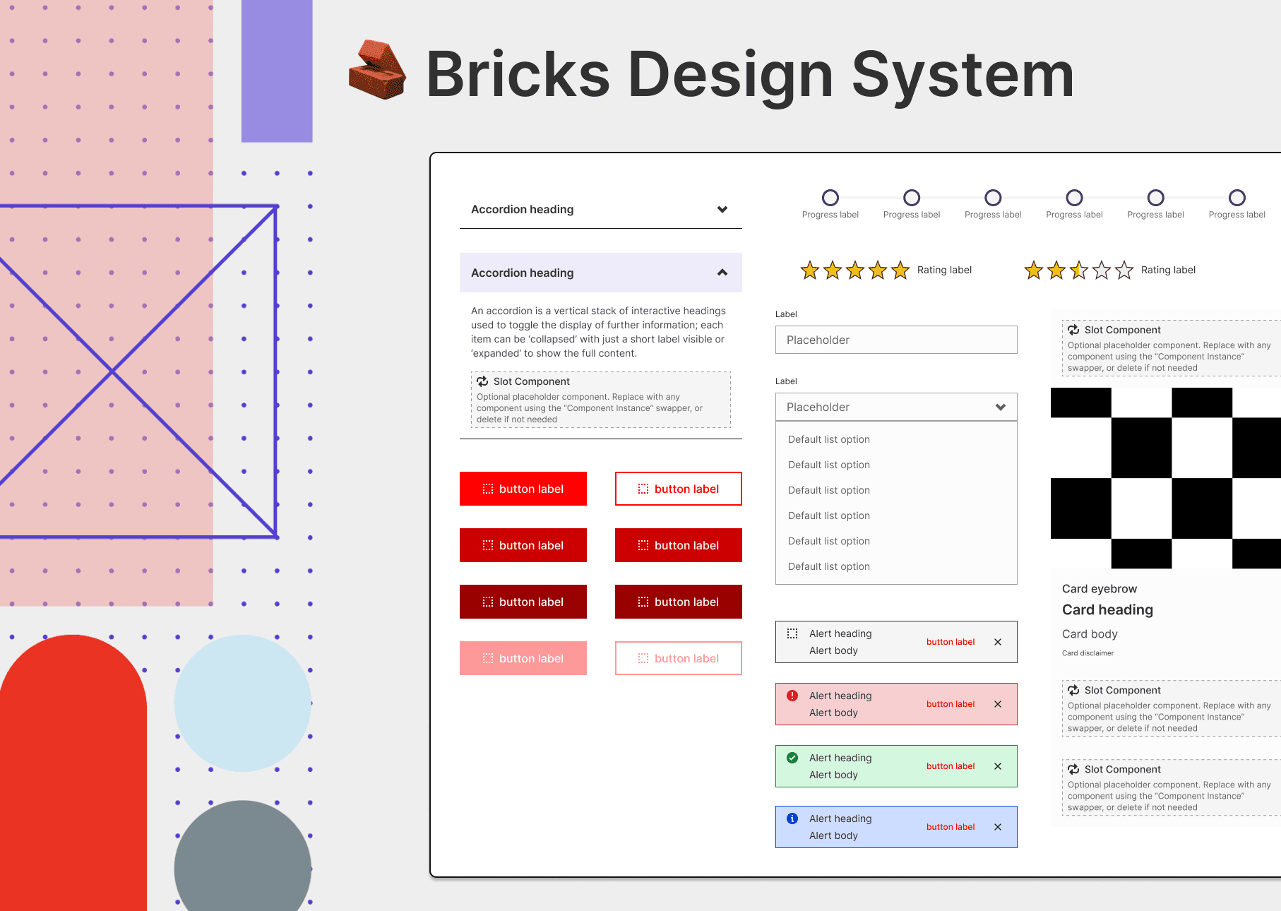
Before Bricks, each team essentially spoke a different dialect of the same design language. Components were rebuilt from scratch across teams. Naming conventions were inconsistent. High-performing assets couldn't be easily shared or repurposed because there was no shared architecture to slot them into.
This fragmentation had downstream effects on everything: design and engineering handoff lacked clarity, onboarding new contributors was slow and inconsistent, and performance testing was harder to scale because the underlying UI wasn't standardized enough to draw reliable conclusions from.
The opportunity wasn't just to build a component library — it was to build the shared infrastructure that would let multiple teams move faster, more consistently, with less rework.
Token Strategy
One of the most complex challenges of this project was establishing a token strategy that could unify a wide range of existing brand styles without forcing a single visual identity onto every team.
We started with a full audit of existing styles and components — surfacing the depth of inconsistencies in naming, usage, and component architecture. That audit directly informed our go-forward approach.
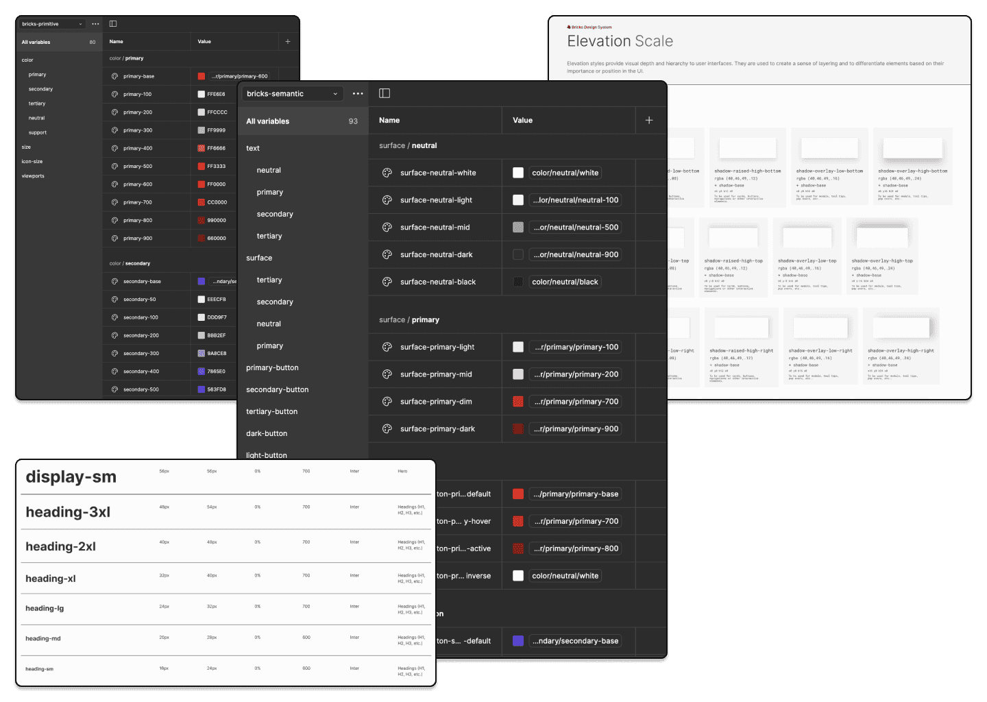
I designed a token system using Figma Variables, structured around a primitive-to-semantic taxonomy. The primitives layer captured brand-specific palettes, spacing scales, elevation values, and grid definitions in a centralized base library. From there, we defined a semantic layer in close collaboration with engineering — mapping tokens like color-background-primary and space-md to primitives, creating a 1:1 bridge between design and code.
This structure gave teams enough flexibility to express their own brand while maintaining system-wide consistency. Edge cases surfaced during rollout and helped us iterate on the token architecture over time — improving flexibility without sacrificing the coherence of the system.
The Approach
With the audit complete and token strategy defined, we moved into building the core library. We established a consistent Figma file structure and prioritized standardizing naming conventions before touching any components.
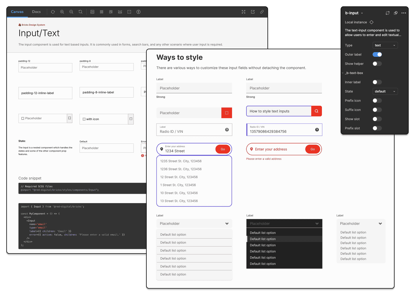
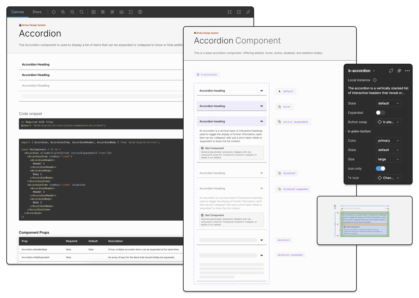
The build followed an atomic design methodology — small, reusable base components first, more complex patterns and templates built on top of them. We incorporated slot components to give teams controlled flexibility: the ability to customize and extend the system within defined parameters, without fragmenting it.
The build process was intentionally iterative. While establishing the core foundation, we were simultaneously developing higher-order patterns aligned with high-performing assets from existing teams — the work that had originally surfaced the need for a systemized approach.
As the library matured, we shifted focus to adoption and governance. We introduced a governance model designed to scale across multiple brands without introducing bloat — with clear decision-making frameworks to help teams evaluate whether new additions were necessary or achievable through existing components and tokens.
Operationally, we used FigJam to map governance flows and decision trees, a dedicated Slack channel for requests and bug reports, and an automated Jira workflow for tracking and prioritization. Weekly triage meetings with cross-functional leads kept the system moving without becoming a bottleneck.
The Solution
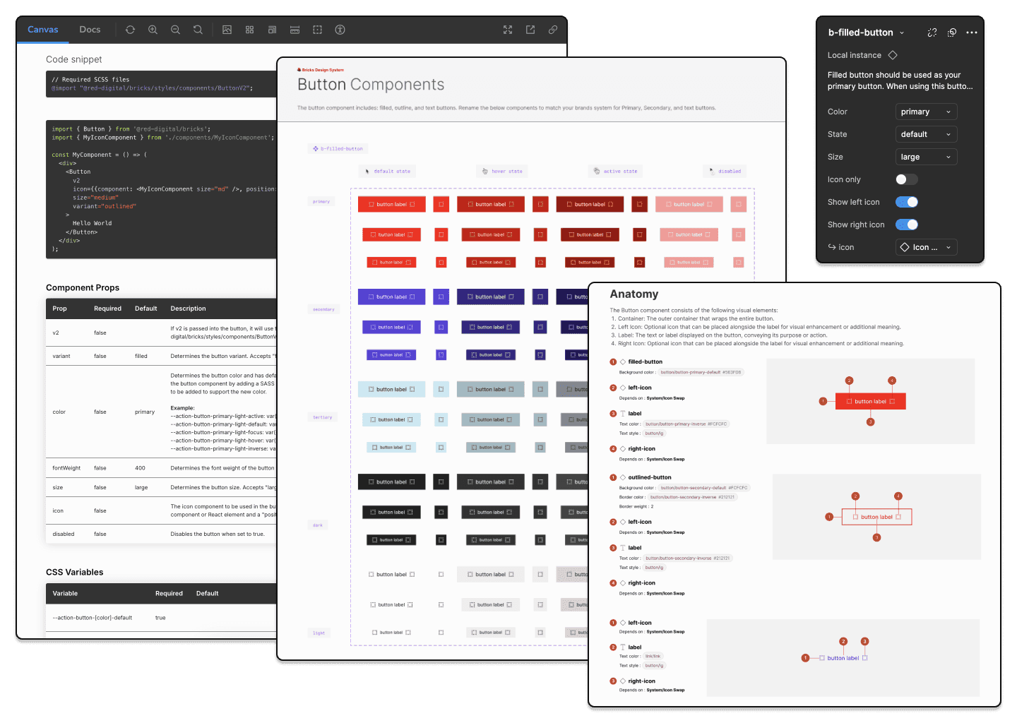
The finalized system shipped as three core Figma libraries — a token library, a component library, and a patterns library — alongside a dedicated Storybook instance for engineering, where teams could interact with live components and reference implementation details directly.
We took a phased rollout approach to drive adoption: stakeholder walkthroughs first, followed by 1:1 sessions with design and engineering teams to integrate the system into their existing workflows. The core token and component libraries shipped first, followed by the patterns file housing higher-order components built from shared high-performing assets.
Impact
Adoption moved quickly once teams experienced the system firsthand.
Engineering efficiency improved by 50% — teams were no longer rebuilding UI from scratch, and the reduction in technical debt was visible almost immediately. Designers gained a complete, flexible component library, though some faced an initial learning curve adjusting to working within a structured system rather than building ad hoc.
Leadership became one of the system's strongest advocates, consistently championing it during planning and reviews. But the outcome I'm most proud of isn't an efficiency metric — it's the cultural shift Bricks enabled.
With a shared source of truth, design and engineering began collaborating differently. The design system became a forcing function for earlier alignment, tighter feedback loops, and clearer handoffs. Teams that had been working in parallel started working together.
Lessons Learned
If I were starting over, I'd take an even more incremental approach — fewer components at launch, rolled out in smaller controlled phases. Some of the early components were too complex for first-time users, which created unnecessary friction during onboarding.
I'd also lean into an "ingredients and recipes" model rather than strict atomic methodology — starting with foundational building blocks and showing teams how to compose them over time, rather than presenting a complete system all at once.
The biggest lesson: simplicity compounds. The more intuitive the system, the faster the adoption, and the more durable it becomes as teams and business priorities shift. Governance and support matter as much as the system itself — adoption is rarely immediate, and consistent follow-through is what separates a design system that sticks from one that gets abandoned.